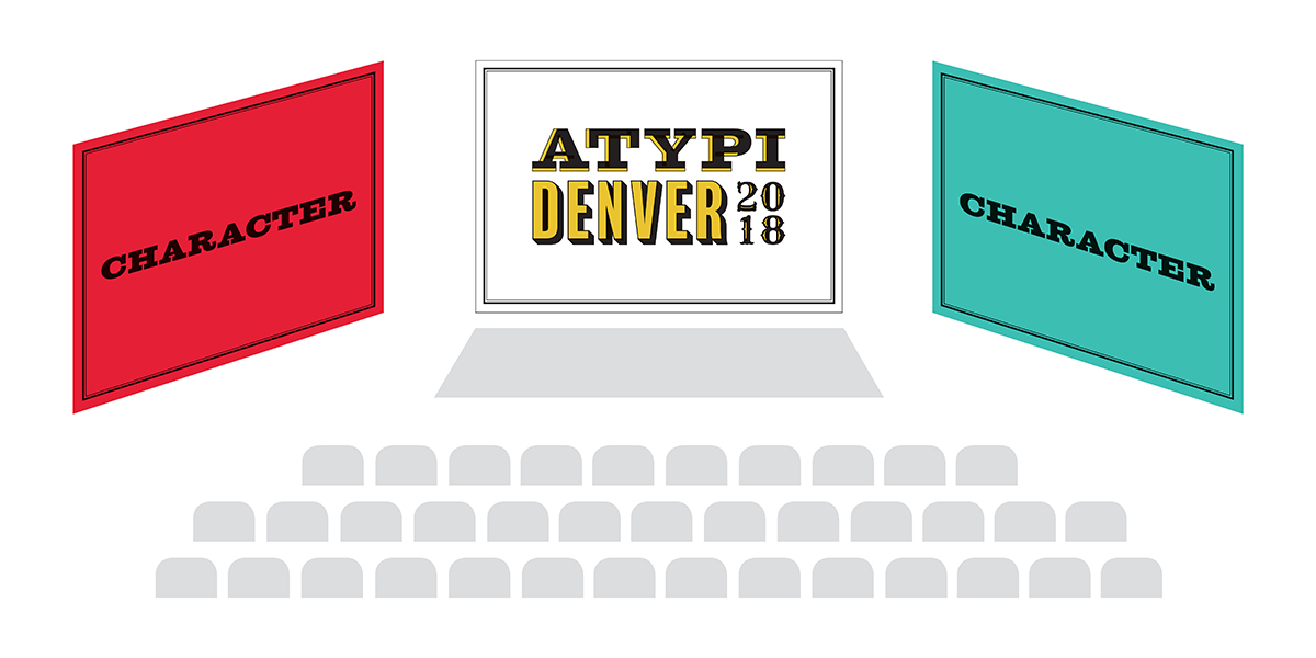
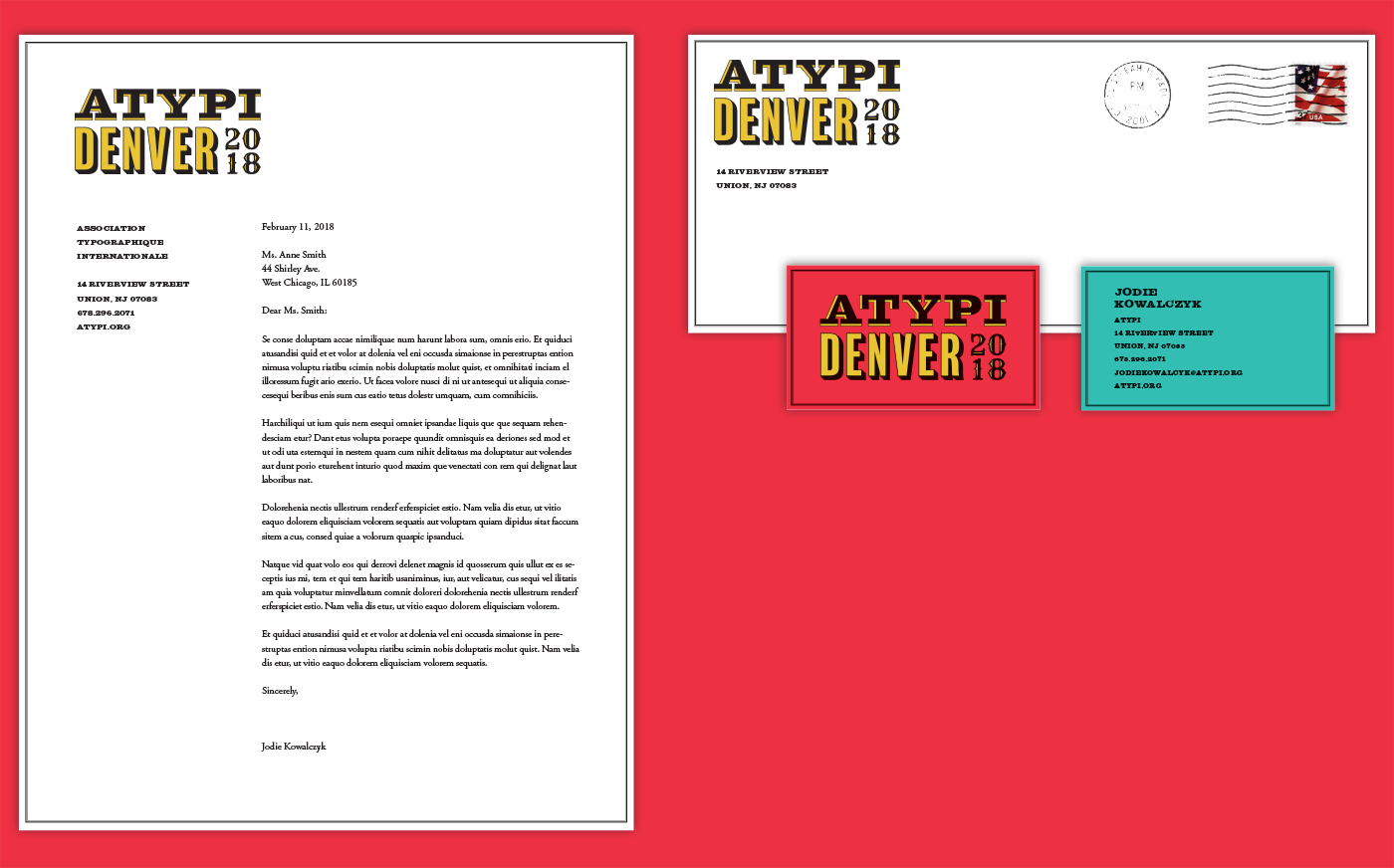
AtypI Conference
Branding / Brochures / Posters
Conference Branding
The goal of this project was to create a branding identity for ATypI, a typography conference that is held each year, this time in Denver, Colorado. Since a wide variety of typography can be found throughout the Denver area, “Character” was chosen as the event’s theme name. The name refers not only to a single letterform, but also to the personality of found typography.

Logo Design
The logo uses three typefaces that each have their own unique qualities. The multiple typefaces express Denver’s range of typography and its eclectic nature.


Stationery System
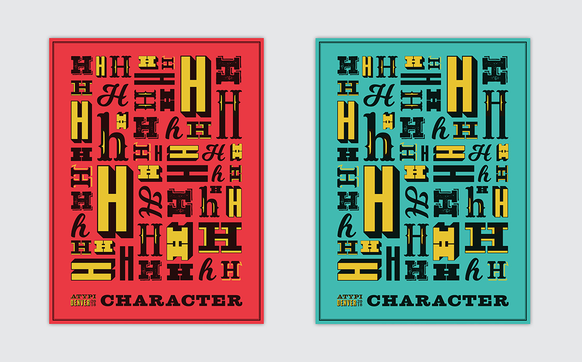
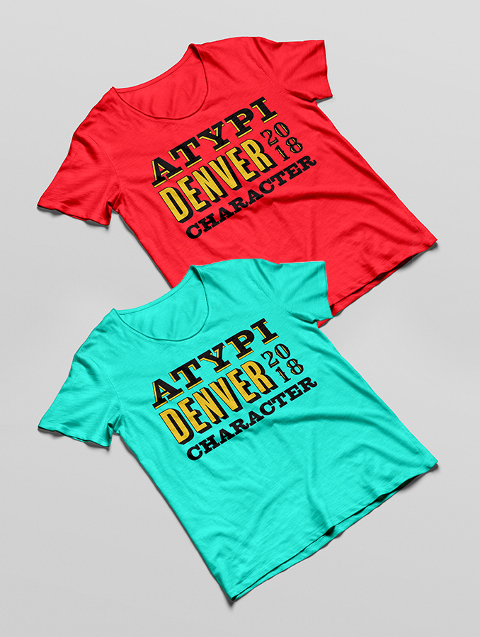
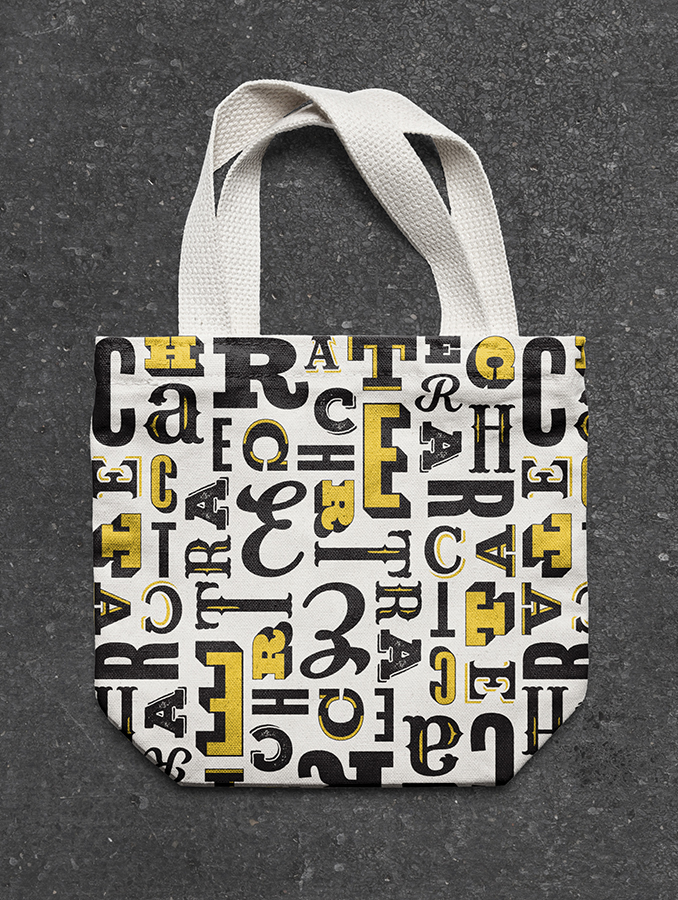
Below is the stationery system designed for the event. The use of red, blue, and yellow reference the Denver and Colorado flags.
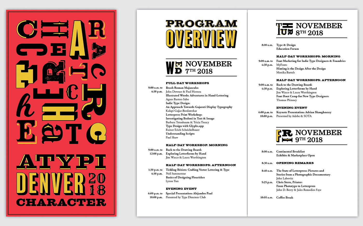
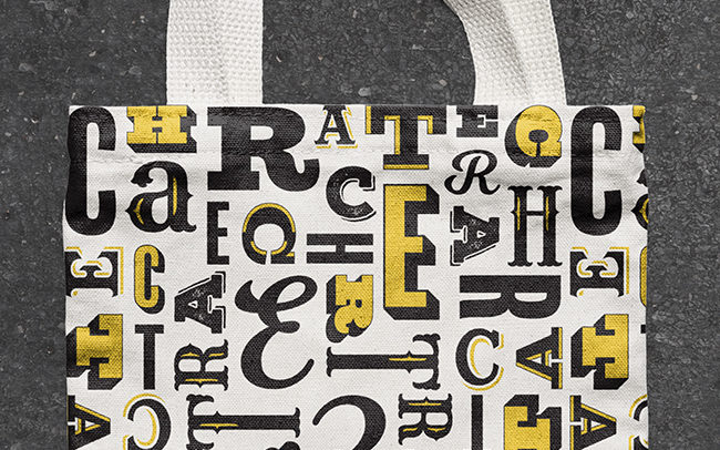
Badges
The badges are color-coded according to speaker, attendee, and staff. Characters of varying sizes, orientations, and typefaces are used as secondary marks and also spell out the theme name, “character.”

Program
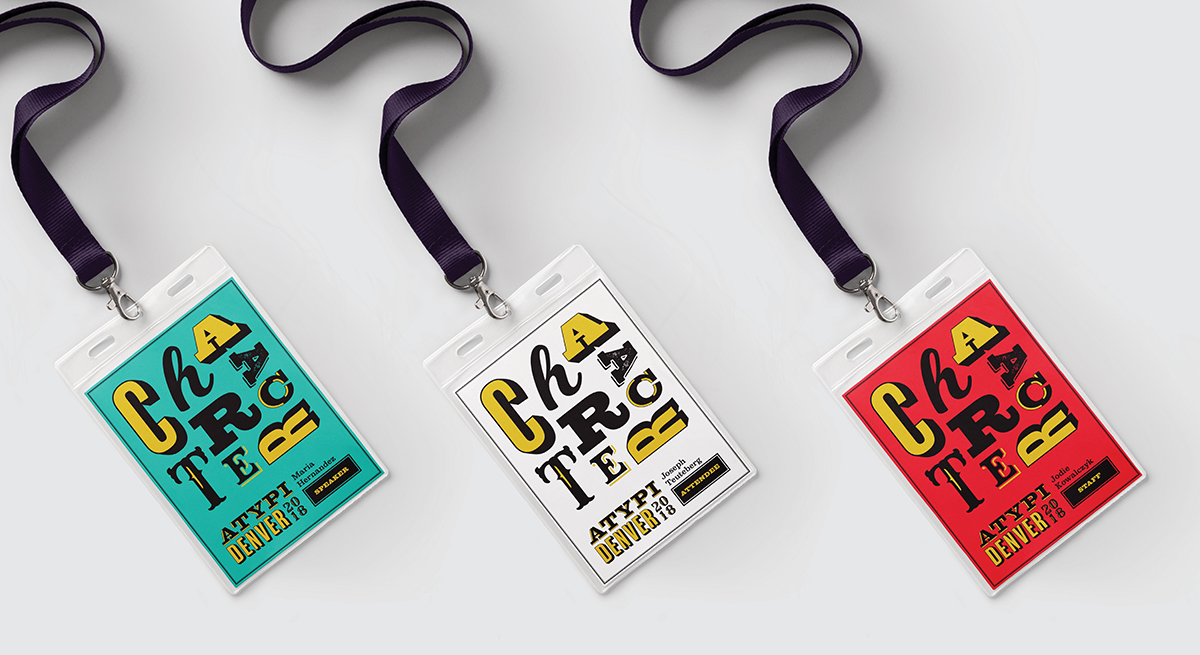
The program cover also uses the letterforms in “character” as secondary marks. Similar type treatments are carried into the program booklet for headings and subheadings.


Posters
A series of twenty-six posters would be designed for the event, one poster for every character in the alphabet. Each attendee would get a different poster depending on the first character in his or her name. Here is an example with the letter “H.”
T-Shirts & Bag
T-shirts for the event would be available in both red and blue. The bag design continues to experiment with the size and orientation of the characters.


Screen Graphics
Three screens would appear behind speakers at the event. The middle screen would display the logo and the left and right screens would display the theme name.


